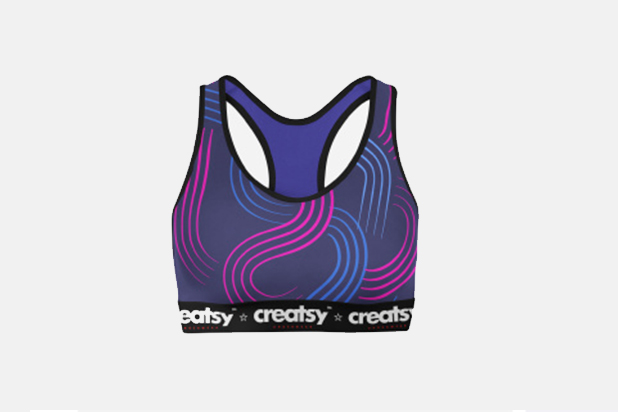
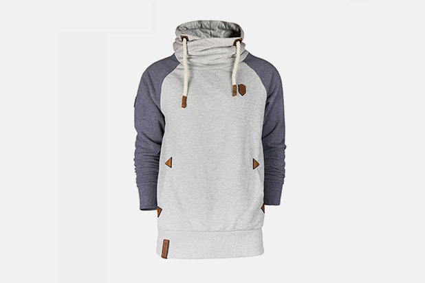
Colour is the first thing anyone notices about a team, and the last thing most buyers check properly. A kit can be well cut, well made and well priced, and still look wrong because the red is a shade too dark, the white is actually cream, or the two colours that looked balanced on a screen fight each other on a pitch.
This guide is written for clubs, brands, schools, distributors and team managers choosing colours for custom sportswear. It covers how to build a colourway that works commercially, how to set blocking proportions so the design reads as intended, how sublimation handles colour, and how to approve the result before bulk production.
Quick answer: choose team colours in three roles — a base, a dominant block and an accent. Keep one clearly dominant. Confirm the scheme against colour references on the actual fabric, not on screen, and remember that sublimation reproduces the design accurately but its final shade is influenced by the base fabric beneath it. Approve a physical sample under daylight before bulk production.
If you are planning a kit, start from our custom sportswear range, and see the design reference for fits and silhouettes once the colours are settled.
Most colour problems in team kit come from treating colour as a single decision. A colourway works when each colour has a job.
| Role | Job | Typical placement | Share of garment |
|---|---|---|---|
| Base | Durable ground colour; controls cost and stock | Body, main panels | 50–70% |
| Dominant block | Creates the identity and the contrast | Sleeves, shoulders, side panels | 20–40% |
| Accent | Adds precision and energy | Collar, cuff, piping, logo ground | 5–15% |
| Neutraliser | Separates two strong colours that meet | Thin divider, side stripe, trim | Optional |
Two rules follow. First, if two colours cover similar areas, the kit reads as unresolved — give one clear dominance. Second, a thin neutral divider between two strong blocks is often what makes an ambitious colourway look deliberate rather than accidental, and it costs very little to add.
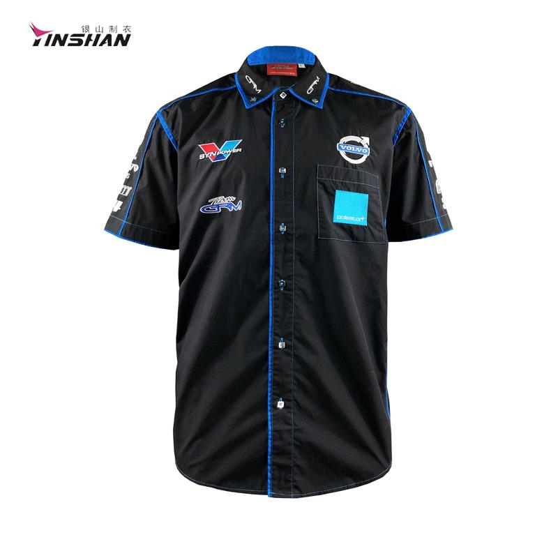
A team colourway is a specification, not a preference: it fixes the fabric, the decoration method and the reorder reference.
The families below are the ones we are asked for most often in team colourways. Each has a practical note that decides whether it will work at volume.
| Colour family | Team use | What to check |
|---|---|---|
| Warm red and coral | Home kit, fan merchandise | Reds shift between substrates; approve on the real fabric |
| Vibrant orange | Away kit, high-visibility training | Strong contrast with black and navy; check light-fastness outdoors |
| Bright yellow | Accents, goalkeeper and visibility kit | Hardest family to match across mixed materials |
| Fresh green and turquoise | Outdoor, training, lifestyle ranges | Pair with sand or navy; test fastness for outdoor use |
| Lavender and soft pastels | Women's teams, lifestyle and supporter wear | Pastels show seams and shading; agree the stitch plan early |
| Black and white | All categories; classic and premium kit | Create depth with matte and satin finishes rather than extra colour |
| Beige, ecru and neutrals | Training kit, coaching staff, lifestyle | Neutrals must match across garment types; control dye lots |
| Confident colour blocking | Team kit, cycling, esports | Agree panel sizes and placement on a sample before bulk cutting |
A colourway that looks good in isolation can still cause problems on the field, particularly where two teams meet, or where a design has to stay legible against grass, track or court surfaces. Three practical checks reduce the risk: confirm the kit contrasts with the opponent's usual colours, check that numbers and names remain readable at the distance a spectator or official views them, and consider how the kit reads in black-and-white, since some broadcast and print contexts remove the colour entirely.
Sublimation carries gradients and photographic colour, but the printed shade is still influenced by the base fabric.
Blocking is where a colourway becomes a design. Because panels already exist for fit, assigning colours to them costs almost nothing extra, but the proportions decide how the kit reads.
Vertical blocks lengthen the body. Side panels in a darker or contrasting shade slim and lengthen the silhouette, which helps one pattern serve a wide size range.
Horizontal blocks broaden. Yoke and chest bands draw the eye across the shoulders, which reads as stronger and more athletic.
A dark base with a bright block reads as technical. This is the most common kit structure in performance sport for a reason.
A light base with a dark block reads as classic. Traditional and clean, and it keeps sponsor space legible.
Decoration must clear the colour change. Numbers, names and sponsor logos should sit inside a single colour zone, or legibility suffers.
Keep the colour count low. Two colours plus a trim is the practical ceiling for most programmes before minimums and complexity rise.
Sublimation is the dominant decoration route for team kit because it carries any number of colours, gradients and photographic detail without adding weight or hand-feel. It also has real limits that buyers should understand before approving artwork.
The base fabric influences the result. Sublimation dyes the fabric rather than sitting on top of it, so a white base gives the truest colour. On a light grey, mid-tone or coloured base, every printed shade shifts accordingly.
Polyester-based fabrics are required. Sublimation needs a suitable synthetic substrate. On cotton or high-cotton blends, a different print method has to be used.
Printed colour is not a fabric dye. A sublimated red and a dyed red trim will not match exactly; expect a small difference and plan for it.
Small type and thin lines have limits. Fine detail can soften during transfer. If the design depends on fine elements, confirm them on a sample.
Colour references still apply. Supply a colour-library reference or a physical swatch, and confirm the result on the actual fabric rather than on paper.

Approving colour happens on a physical sample under daylight — never on a screen or a digital mock-up.
The pre-production sample is the only reliable colour approval point. The checks below are the ones that catch problems before bulk production.
| Check | What to do | Why it matters |
|---|---|---|
| Daylight review | View the sample outdoors and indoors | Artificial light distorts warm colours badly |
| Distance review | Step back and assess number and name legibility | Kit is seen from a distance, not at desk range |
| Cross-piece check | Compare shirt, shorts and socks side by side | Different substrates and dye systems may not match |
| Wash test | Launder once and re-check colour and shrinkage | Fastness and dimensional change only appear after washing |
| Camera check | Photograph and view on screen | Media-facing kits are judged from photographs and video |
Approving colour on screen. Displays are not calibrated and fabric absorbs light differently.
Equal coverage for two strong colours. The kit loses hierarchy and looks unfinished.
Mixing materials without a master standard. Trims, threads and elastics use different dye systems and will not match automatically.
Forgetting the opponent. A colourway that clashes with likely opposition colours creates a practical problem all season.
Skipping the wash test. Fastness and shrinkage change the kit after a few weeks of use.
Ignoring the dark ground for logos. Sponsor marks disappear on deep blacks and navies unless contrast is designed in.
Two colours plus a trim is the most practical structure for most programmes, and three plus a trim is the usual ceiling before cost and complexity rise. Beyond that, sublimation becomes more economical than cut-and-sew blocking.
Closely, when a colour reference or physical swatch is supplied and the base fabric is light. Because the base fabric influences the printed shade, and because printed colour differs from dyed trims, plan for a small variation and approve it on a sample.
Fix a durable base colour and change the accent, trim or decoration detail each season. That keeps tooling and minimums stable while giving the kit a reason to be refreshed.
Yes, in most sports the goalkeeper must be distinguishable from both teams. Visibility colours such as bright yellow, orange or fluorescent shades are the usual choice, and they also help the goalkeeper stand out in low light.
A team colourway works when each colour has a role and the proportions are agreed. Choose a base, a dominant block and an accent, fix one colour standard, confirm it on every fabric in the kit, and approve a physical sample — ideally after a wash test — before bulk production.
Send Yinshan Sportswear your garment list, colour references, logo or artwork, estimated quantity, target date and delivery country to request a custom quote.
 English
 Español
 Português
 Français
 Pусский
 Deutsch
 العربية