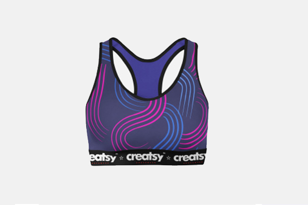
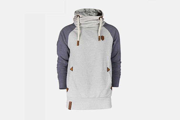
Colour is the most visible decision in a sportswear range and the one most often made without a system. A palette that is planned carries a range across garments and seasons; a set of individual colour choices produces a catalogue that looks like several different brands.
This page explains how colour trends translate into an actual production decision — how colour runs work, how a palette is structured for a range, and how to plan colour so it can be repeated.
Quick answer: Structure a sportswear palette in three parts: two or three base neutrals that carry the volume and can be reordered for years, one or two seasonal accents that change, and one or two club or brand core colours that stay fixed. Base neutrals absorb the risk; accents carry the season; core colours carry identity. Colour trends should influence the accents rather than the bases, because the bases are what a buyer has to be able to reorder next season without a colour mismatch.
Understanding the production route explains why some colours are easy to repeat and others are not.
Dyed fabric — the yarn or fabric is dyed in a batch; colour varies slightly between lots.
Stock colours — a supplier's standing palette; repeatable indefinitely without a dye lot risk.
Sublimated colour — printed onto fabric from a digital file; repeatable exactly, requires polyester.
Yarn-dyed or melange — colour built into the yarn, which limits the palette but rarely shifts.
The practical implication is that a club or brand wanting exact colour continuity should choose stock colours or sublimation. A custom dyed lot can be matched closely but not guaranteed identical across seasons, and the difference is most visible on mid-tones and saturated colours. This interacts directly with the decoration method, described in sublimation and digital printing.
| Palette element | Role | How it behaves across seasons |
|---|---|---|
| Base neutrals (2–3) | Volume: the bulk of the range | Stable for years; reorder without colour risk |
| Seasonal accents (1–2) | Refresh: newness on existing styles | Change each season; small quantities |
| Core identity colours (1–2) | Recognition: club or brand colour | Fixed; never trend-led |
| Contrast / detail colour | Trims and small areas | Cheap to change and highly visible |
This structure does two things at once. It gives a range enough novelty to look current, and it keeps the pieces that carry volume — the neutrals and the identity colours — stable enough to reorder. Trend-led colour belongs in the accents, the trims and a small number of hero pieces rather than across the whole range.
A colour trend arrives as a set of references and has to become a specification. Three steps connect the two.
Select — narrow the reference to two or three colours that can actually be produced in your fabric.
Reference — convert each to a Pantone or a physical swatch rather than keeping a screen image.
Approve — see the colour on the actual fabric, printed or dyed, before committing.
The approval step is where most colour errors are caught. Saturated greens, oranges and deep blues shift most when applied to a knit or bonded into polyester, and a screen proof will not reveal it. Our wider notes on season colour direction are in colour trend research.

Seasonal colour works as a range decision, because a palette applied consistently across garments is what makes a range recognisable.
Colour decisions do not stand alone; they interact with how the garment is decorated and where the mark sits.
Dark base with a light mark — the highest contrast and the most legible at distance.
Light base with a fine mark — the most common legibility failure, especially in daylight.
Tonal mark — subtle and expensive to get right, because any colour shift is visible.
Accent used only for trim — the cheapest way to introduce a seasonal colour.
For a club whose colours are fixed, the palette is not negotiable and the design work moves to how the colours are divided across panels and where the contrast sits. That is described in designing sportswear that stands out.

The cheapest way to refresh a range is one new accent colour applied to existing styles.
A palette only works when it is applied across the whole range rather than per garment. That requires the palette to be fixed before the range is specified, not as each item is ordered.
Fix the palette first, then assign colours to garments.
Keep base neutrals consistent across the polo, tee, hoodie and jacket.
Use the accent on one or two items only, so the range does not become busy.
Keep the mark colour constant, since it is the element that appears on every garment.
Record colour references against the order, so a reorder matches.
Recorded references are what make the palette usable a year later. Without them, the second season's neutrals will be close but not identical, and the garments will not look like the same range when worn together. That documentation discipline is the same one that governs any repeatable apparel programme, described in building a repeatable apparel programme.

Base colours carry the volume; accents carry the season. Confusing the two leaves stock that cannot be repeated.
A planned palette reduces three costs at once. It reduces stock risk, because the unstable colours are held in small quantities. It reduces sampling cost, because neutral repeats do not need re-approval. And it improves brand recognition, because the same base colours appear across every garment and every season. None of that requires a bigger budget — only that colour is decided as a range rather than as a set of separate orders.
Structure the palette in three parts: two or three stable base neutrals that carry the volume, one or two seasonal accents that change, and one or two fixed identity colours. Apply the palette across the whole range rather than per garment, and record the references so a reorder matches.
Custom dyed fabric is produced in lots, and colour shifts slightly between them. Stock colours and sublimated colours are more repeatable, which is why a buyer who needs exact continuity across seasons should choose one of those routes rather than a bespoke dye.
Convert the reference to a Pantone number or a physical swatch, then approve it on the actual fabric. Screen proofs mislead, particularly for saturated greens, oranges and deep blues, which shift when applied to a knit or bonded into polyester.
Only in the accents. Club or brand identity colours are fixed, and base neutrals need to be reorderable for years. Seasonal colour belongs in trims, accents and a small number of hero pieces where the risk of unsold stock is limited.
Send your identity colours and the direction you want for the season, and we will propose a working palette — bases, accents and trims — with colour approved on the actual fabric before production.
 English
 Español
 Português
 Français
 Pусский
 Deutsch
 العربية